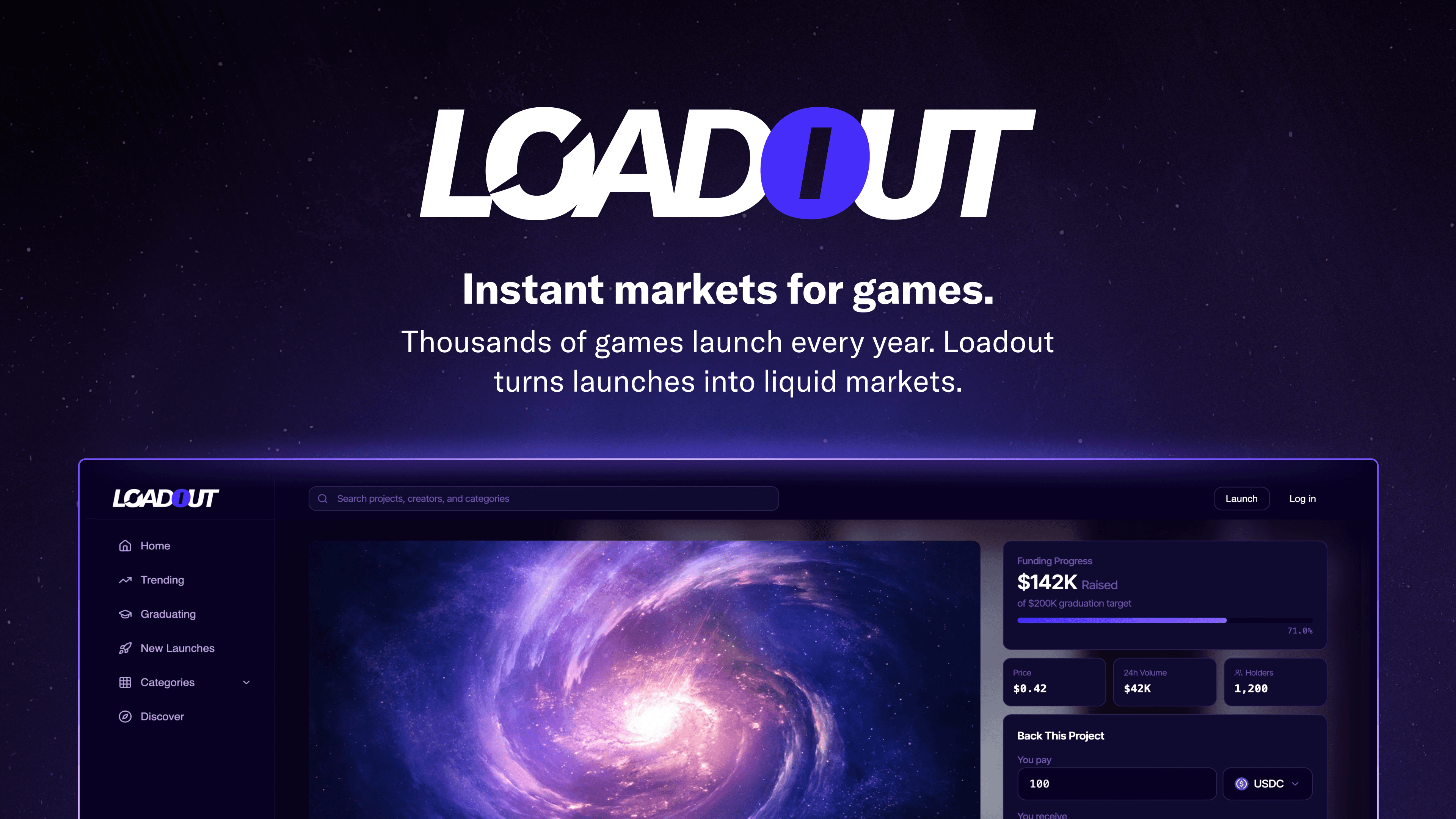
Loadout Protocol
Product Design, Brand, Frontend
2026
Project Overview
Loadout is a launch platform that gives game studios instant access to capital by letting them create a token-backed project page and start trading from day one. Instead of chasing publishers or running campaign-style crowdfunding, studios publish their trailer, demo, roadmap, and team, then open a market. A percentage of every buy routes directly into the game's treasury, funding development in real time as interest grows.
For investors, Loadout solves the worst parts of crypto gaming: insider rounds, private discounts, and unlock cliffs that crush price later. Everyone enters at the same terms from the first trade. Projects graduate based on traction thresholds, not hype cycles, and live signals like treasury growth and holder count let backers price risk in real time rather than betting blind on a whitepaper.
The platform is built on bonding curve mechanics. Pre-graduation, buys fill the game treasury. Post-graduation, a 1% trading fee splits between the developer, treasury, and protocol. The model means every game launch creates a new market, and hit games become recurring fee engines.
My Work
I created the full brand identity for Loadout from scratch, including the logo, visual system, and design system. The brand had to work across two very different audiences: game developers who are skeptical of crypto platforms, and crypto investors who are skeptical of game studios. That meant something credible and clean without defaulting to either the corporate pitch deck look or the usual Web3 aesthetic.
I designed the complete product UI in Figma, covering the studio-facing create flow (tier selection, preset tokenomics, project page setup), the investor-facing project pages (market panel, graduation progress, live signals), and the discovery and ranking system that sorts quality at scale. I used Figma Make for rapid prototyping of interactions and component behavior, then took the designs into Cursor and built the working frontend myself before handing the codebase to the dev team to connect and implement.
I designed the seed funding slide deck that was used to raise a seed round. The deck needed to communicate a layered concept (bonding curves, graduation mechanics, fee splits, the two-sided marketplace) to investors ranging from crypto-native to traditional finance. Because I'd already built the product's visual system, the deck used real product screens rather than mockups, so investors saw what the platform would actually look like, not a concept.
Outcome
Loadout raised its seed round using the deck I designed. The platform shipped with a frontend that matched the original designs because I built it myself, removing the usual translation loss between design handoff and implementation. The design-to-code pipeline (Figma → Figma Make → Cursor → dev handoff) compressed the build timeline. Instead of iterating through rounds of implementation feedback, the devs received working frontend code with the design decisions already in place. The brand system carried through from the product UI to the pitch deck to the marketing site, keeping everything consistent without requiring alignment meetings or brand documentation.
Learnings
The main design challenge was making a complex financial product feel simple without dumbing it down. Bonding curves, graduation thresholds, treasury routing, and fee splits all need to be understood by both studios setting up their project and investors evaluating it. The solution was progressive disclosure: the create flow uses presets so studios can launch without understanding token engineering, while the investor-facing pages surface live data for people who want to dig in.
Building the frontend myself changed how I designed. Every layout, interaction, and responsive decision was weighed against implementation cost, which cut speculative complexity early and meant the Figma files were honest about what would ship. The pitch deck reinforced something I keep seeing: the best decks show the product, they don't explain it. Because I'd already built the brand and UI, the deck featured real screens, and investors were evaluating the actual product experience rather than a promise of what it might become.


